

Current detached home sales levels in Peel region are near the bottom of the 5-year range confirming what is obvious to those currently in the market – detached homes are just not selling as fast as they used to!
What is even more concerning is that they are at the bottom of that range way too early in the year. Generally the tales bottom out closer to the very end of the year but as the Graph 1 shows we reached those levels mid year. More importantly, the turn around occurred immediately after the Ontario government’s announcement to tax foreign buyers. Further, the 2017 high did not surpass previous years 2016 high as prior years did. In fact at the time this data was collected, mid 2017, sales were half of the 2016 level at the same time of the year.

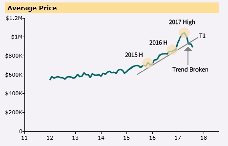
The Average Price Graph 2 shows a break in a 2-year trend. After breaking the trend line, prices briefly rallied but could not break above the trend line, thus failing to make it back into the range.
Note that 2017 price peak was exceptionally high and well out of the top-side of the range, which can sometimes point to a correction, (unfortunately no one can predict when).
As the Average Prices are falling, market will find the next level of resistance at $800K average price level. Breaking this psychological level could see the average price nosedive further, and similarly a bounce would add back some strength to the market.

Graph 3 shows the number of New Listings has come back to the middle of range giving hope that reduction in inventory will lead to more balanced market. Note that the 2017 high for Number of Listings occurred right after the Ontario Government’s announcement, and at that time was nearly twice that of 2016 high, flooding the market in the process.

Active listings, Graph 4, are double the number of 2016 high, showing that we still have some ways to go to clear the backlog. On the positive note, the current activity shows a turnaround and the number of active listings appears to be heading back toward the range, as sellers are taking properties off the market.

Months of Inventory, Graph 5, shows that we are at a 3-year high, and way out of the range. In fact, almost 3 times the inventory that we had at 2016 high, again occurring after the announcement. This is not a good sign, as it could take a few more months to clear out this backlog.

Lastly, Average Days on Market, Graph 6, is still quite high for this time of the year and confirms that due to high inventory numbers, properties are taking much longer to sell, as buyers have plenty of choice.
Condos appear to defy the current market trends, read detailed analysis here
If you are in the market and you need a real, proven, award winning expert, to help you buy or sell your home then call, text or message me to get started.
Marijan Koturic, Real Estate Broker
Orion Realty Corporation, Brokerage
647-892-5007
Disclaimer: Above charts are generated by Toronto Real Estate Board. The technical analysis provided above is for informational purposes only and it is not an investment or buy/sell advice and it is not indicative of future real estate market performance.